The Scholarship and Grants Management Software is a web-based platform designed to streamline the end-to-end management of scholarship and grant programs. The system supports multiple user roles, including administrators, students, and reviewers, enabling efficient application submission, evaluation, and program oversight within a single unified platform.
The project focuses on improving usability, transparency, and operational efficiency through clear workflows, structured data management, and role-based interfaces. By simplifying complex processes and presenting information in an intuitive way, the platform helps organizations manage programs more effectively while providing a smooth and engaging experience for all users.
Problem we had to faced
Complex system configuration
Admin users often deal with cluttered settings, fragmented controls, and unclear dependencies, making system setup and ongoing management difficult and error-prone.
Operational overload & burnout
Let’s be honest… managing programs, users, reviewers, deadlines, and workflows simultaneously can quickly become overwhelming, especially during peak application cycles.
Too many manual tasks
From assigning reviewers and tracking statuses to generating reports and sending reminders, admins are burdened with repetitive manual work that slows operations and increases the risk of mistakes.
Useability Test
Let’s see what people feel while using these apps
User Survey
We conducted one-on-one interviews with key users to understand their daily challenges, needs, and overall experiences while working with scholarship and grants management platforms. The goal was to identify usability gaps, workflow friction, and opportunities to improve efficiency and confidence across roles.
Solution
Simplifying Complex Management Experiences
The solution focused on reducing complexity, improving clarity, and enabling users to complete tasks with confidence through streamlined workflows and role-based design.
Simplifying Complex Management Experiences
The previous navigation structure was overly complicated and made it difficult for users to find the information they needed. To improve this, I re-evaluated the entire information architecture with the product team and introduced a more intuitive and user-friendly layout. The UI was refined to enhance clarity and reduce cognitive load, ensuring a smoother browsing experience.
The navigation was fully restructured to establish a clear hierarchy, streamline user paths, and deliver a more efficient and engaging experience overall.
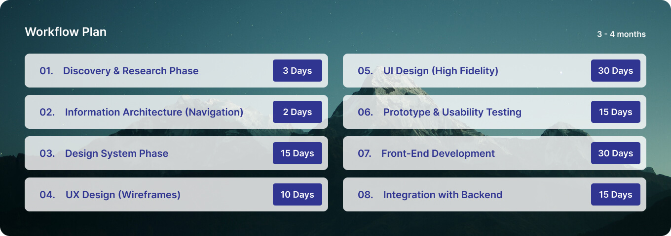
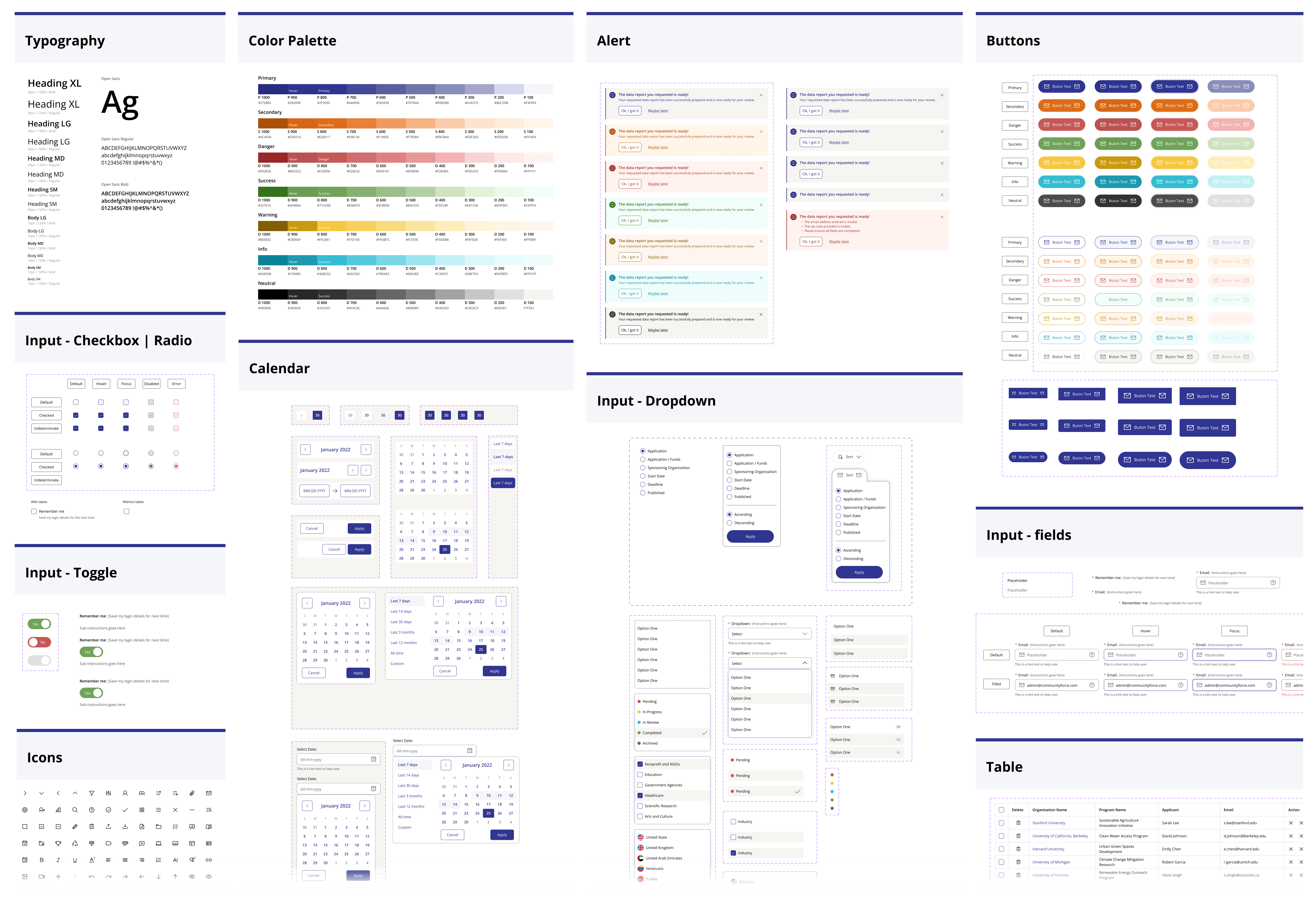
Design System Phase
I established a unified set of standards to ensure visual and functional consistency across the entire product. This included defining typography, color palettes, component states, and interaction patterns.
By creating reusable UI components and clear guidelines, the design and development process became more efficient, scalable, and cohesive. The Design System now serves as a single source of truth that supports faster iteration and maintains a consistent user experience.
UX Design (Wireframe)
In the wireframing phase, I focused on structuring content and functionality based on user needs and business goals. Low-fidelity wireframes were created to define layout, information hierarchy, and user flows without visual distractions.
This phase helped validate ideas early, align stakeholders, and ensure a strong usability foundation before moving into high-fidelity design.
UI Design (High-fidelity)
In the high-fidelity design phase, wireframes were transformed into polished and visually engaging interfaces. The established design system was applied to ensure consistency across typography, color, spacing, and UI components, resulting in a cohesive and scalable visual language.
The focus was on creating a clean, modern interface that enhances usability, supports intuitive interactions, and clearly communicates the product’s functionality while maintaining a strong visual hierarchy.
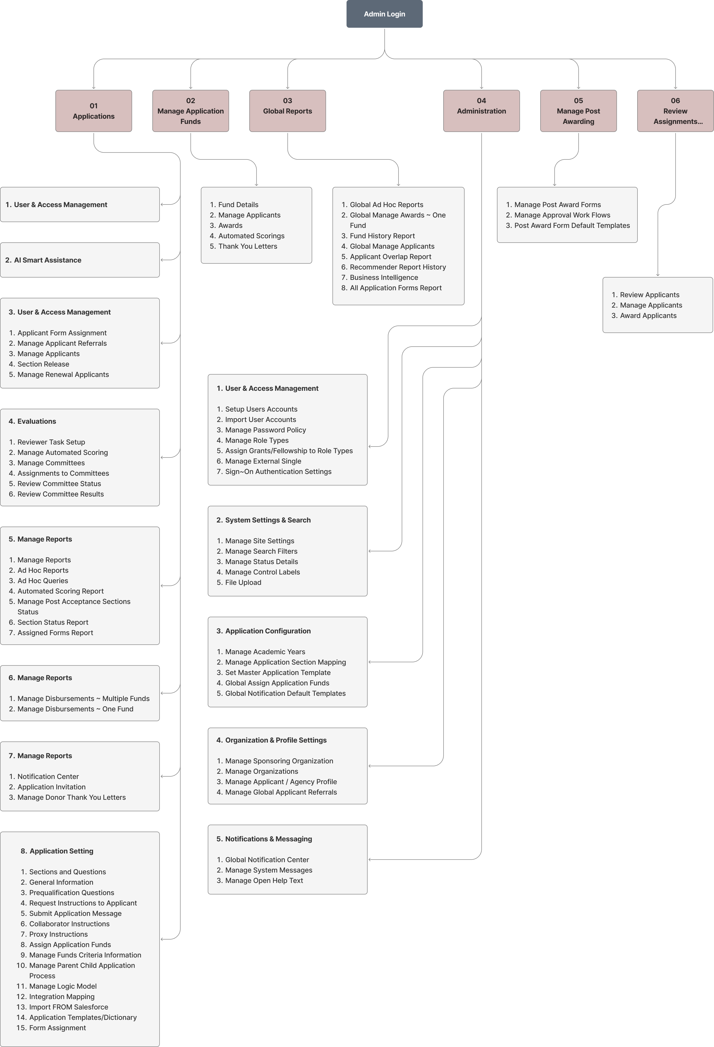
Admin Portal
The Admin Portal was designed to provide system administrators with clear, efficient control over platform settings and user management. The interface prioritizes simplicity and usability for daily administrative tasks.
A strong information hierarchy and streamlined workflows help reduce complexity, improve visibility, and support faster decision-making.
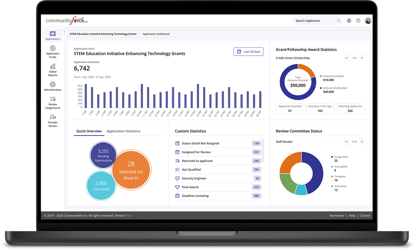
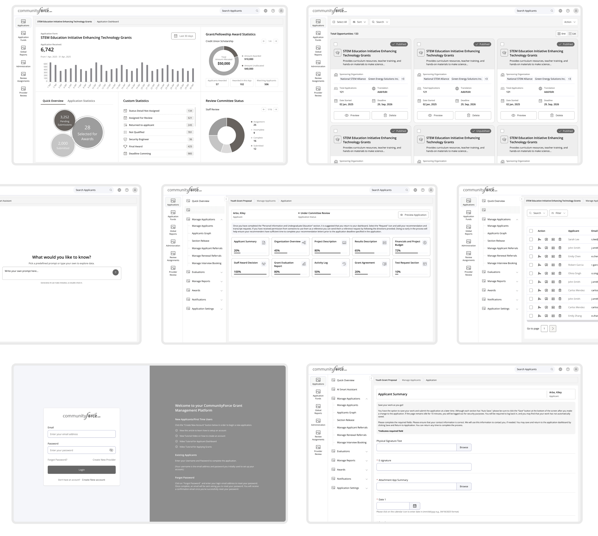
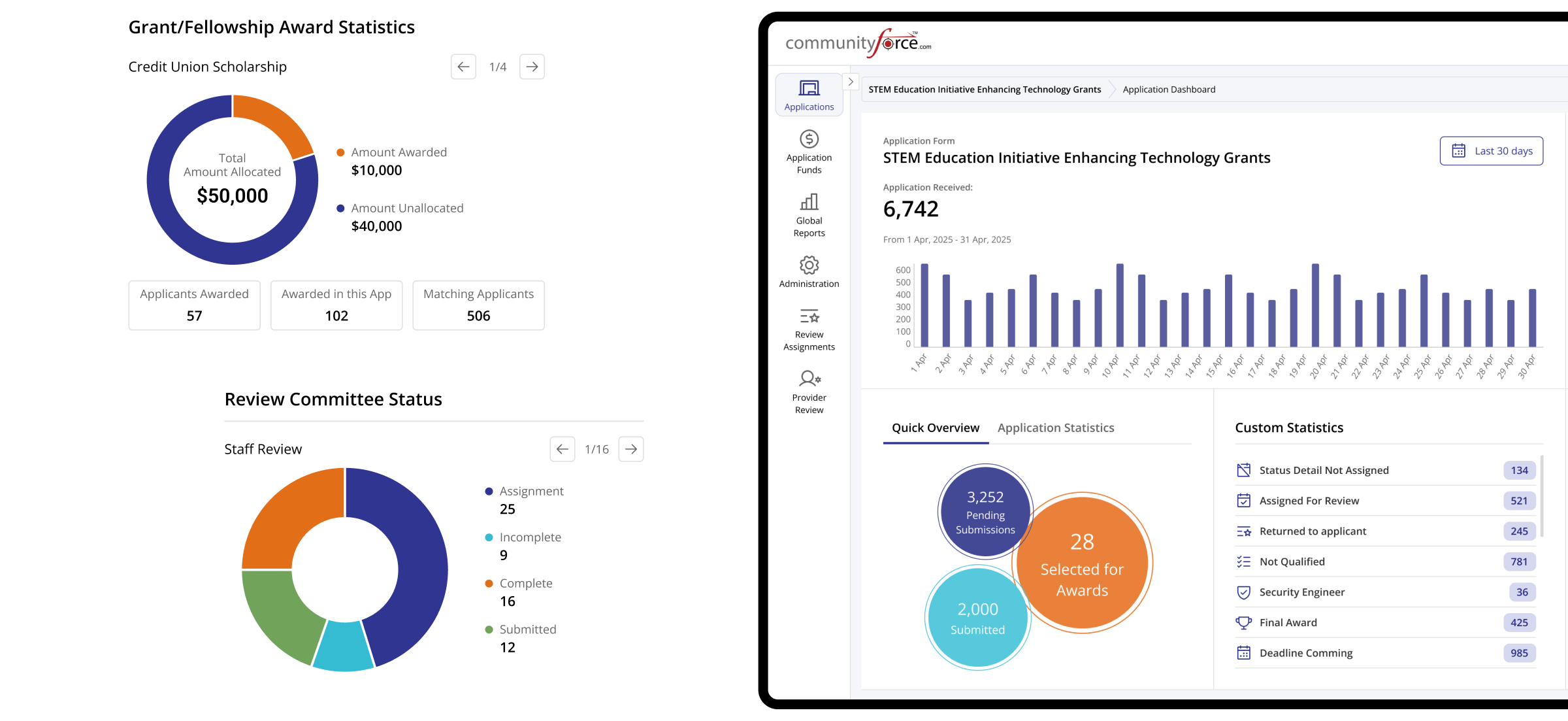
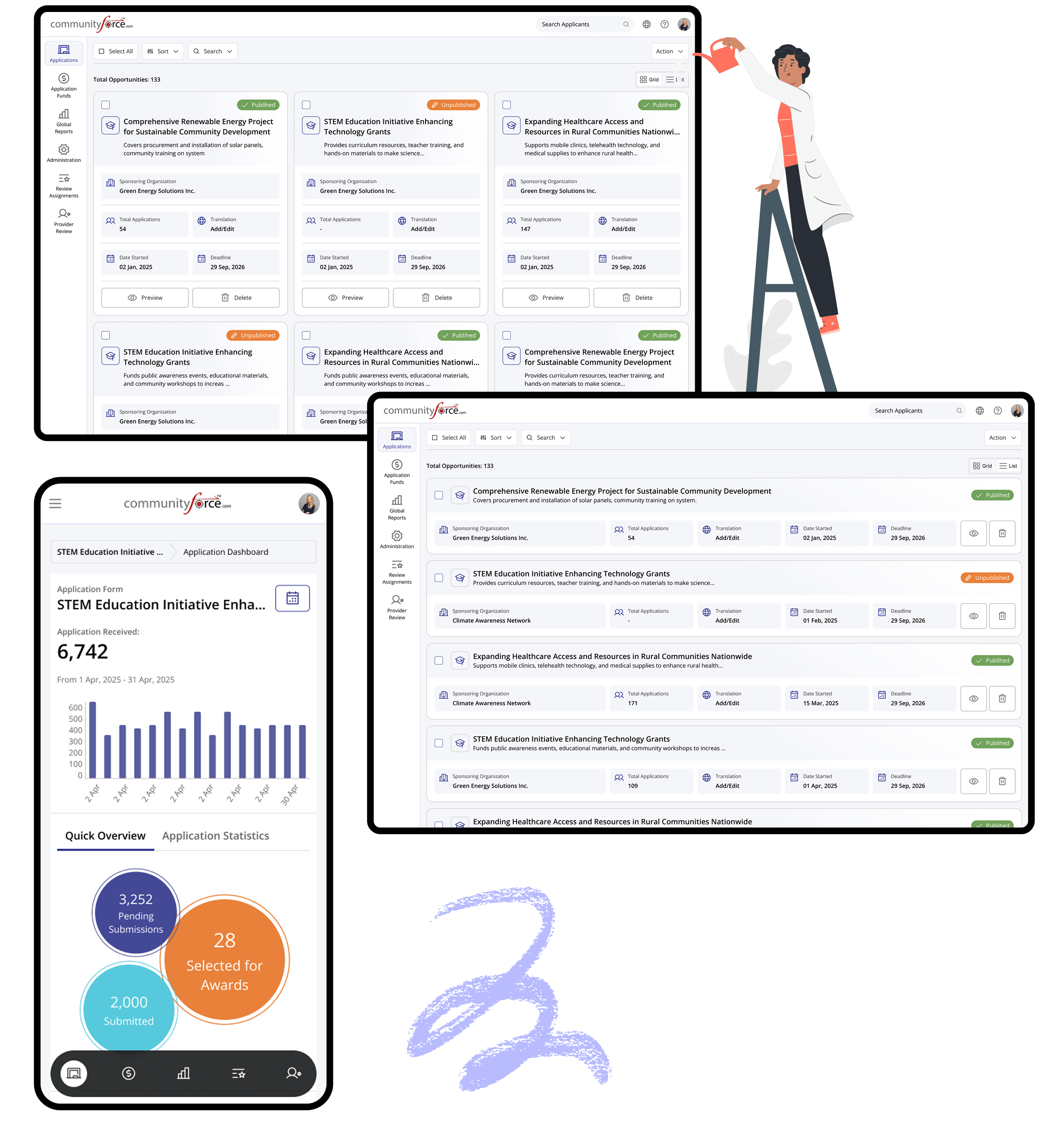
Applications
Everything you need to manage
applications, clearly
View application status, review details, and take action faster. A streamlined workflow designed to reduce manual effort and improve decision-making.
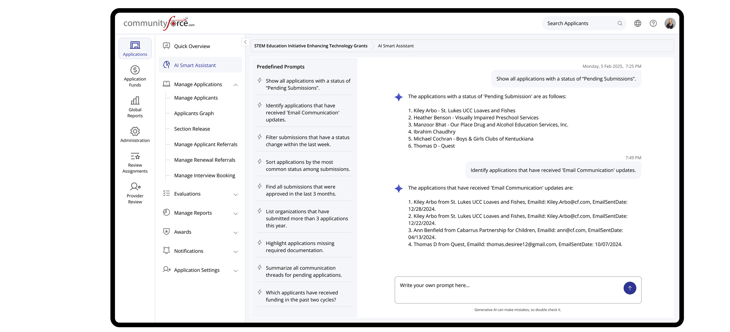
AI Smart Assistance
Instant Answer. Smarter Descision.
Get quick answers about submissions, application status, and user activity. The AI assistant helps you save time and make informed decisions faster.
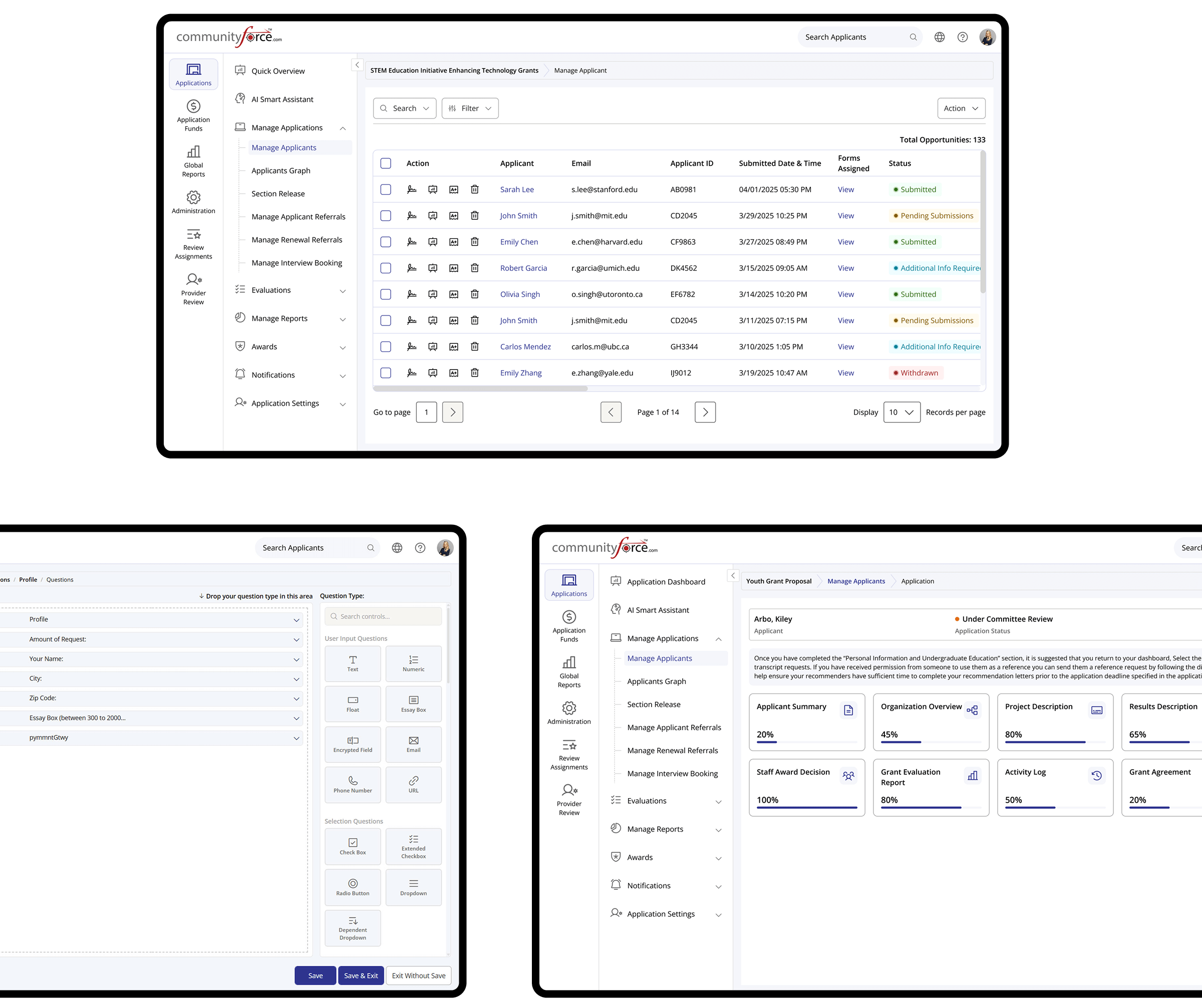
Applicants & Application Builder
From application to submission, fully in control.
Track applicants, review activity from the dashboard, and structure application forms using intuitive drag-and-drop tools that adapt to your program requirements.
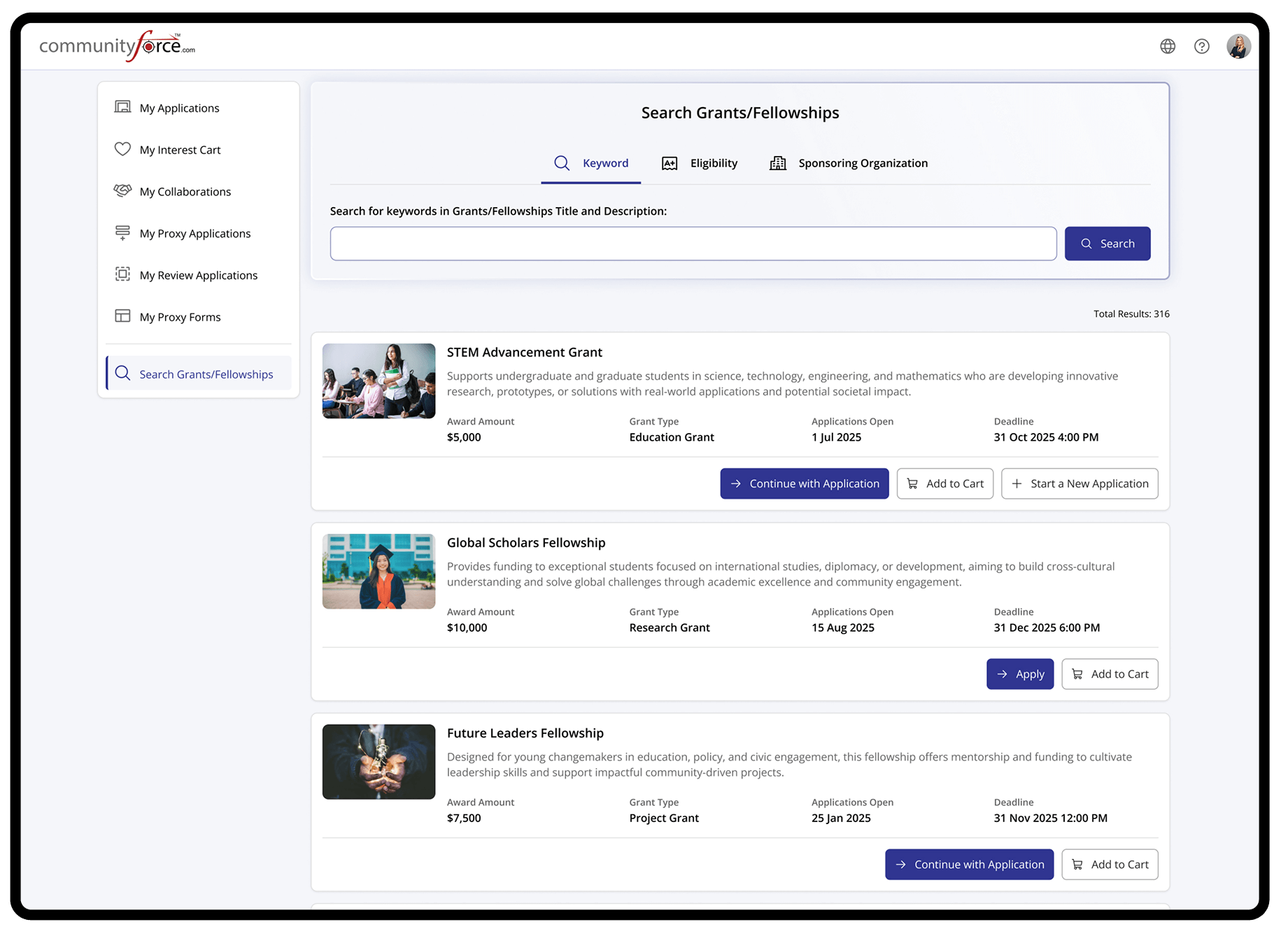
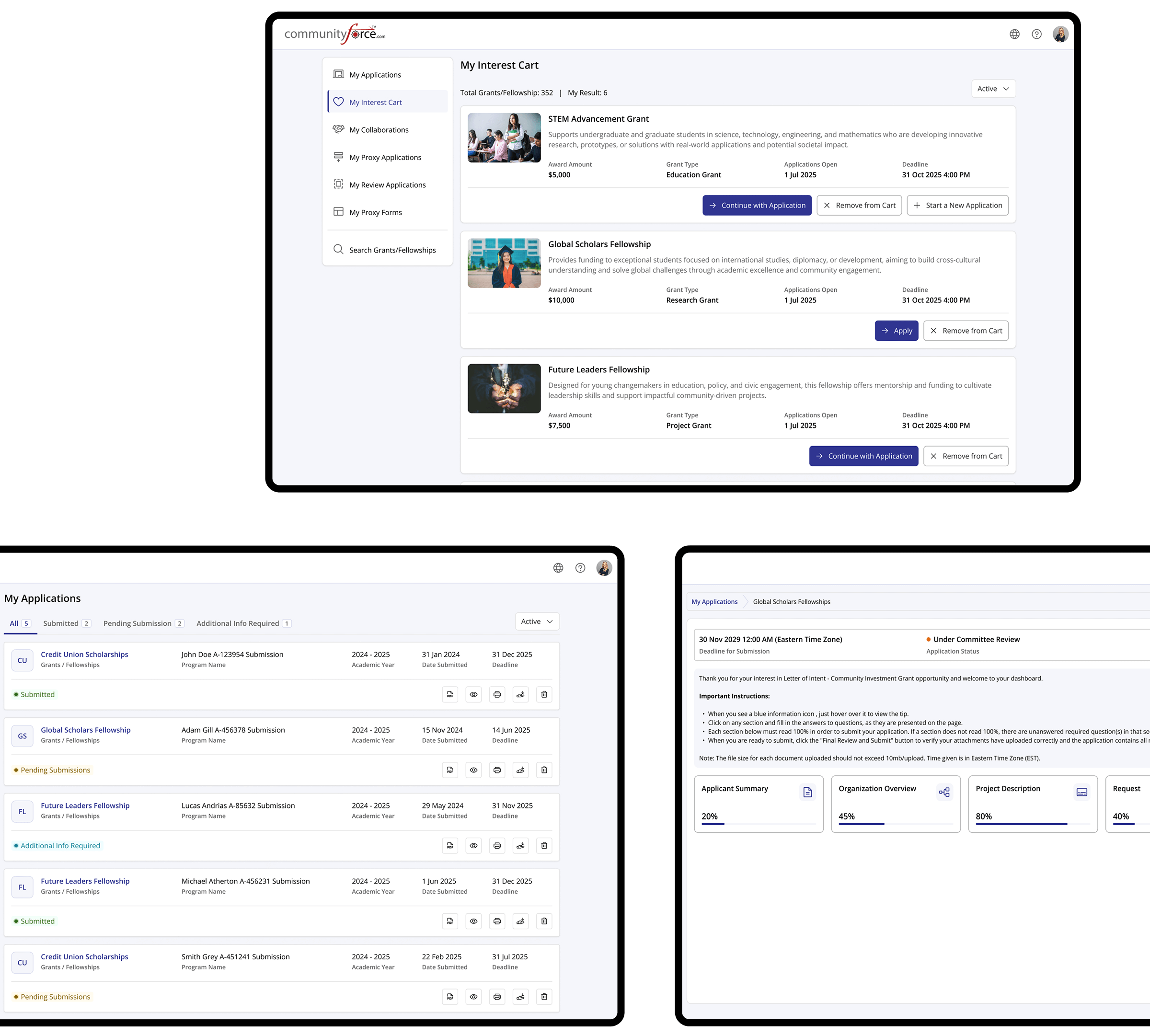
Applicant Portal
The Applicant Portal was designed to provide applicants with a clear and intuitive way to explore opportunities and manage their activities. The interface emphasizes simplicity and accessibility.
Streamlined user flows help reduce friction and support engagement across key applicant interactions.
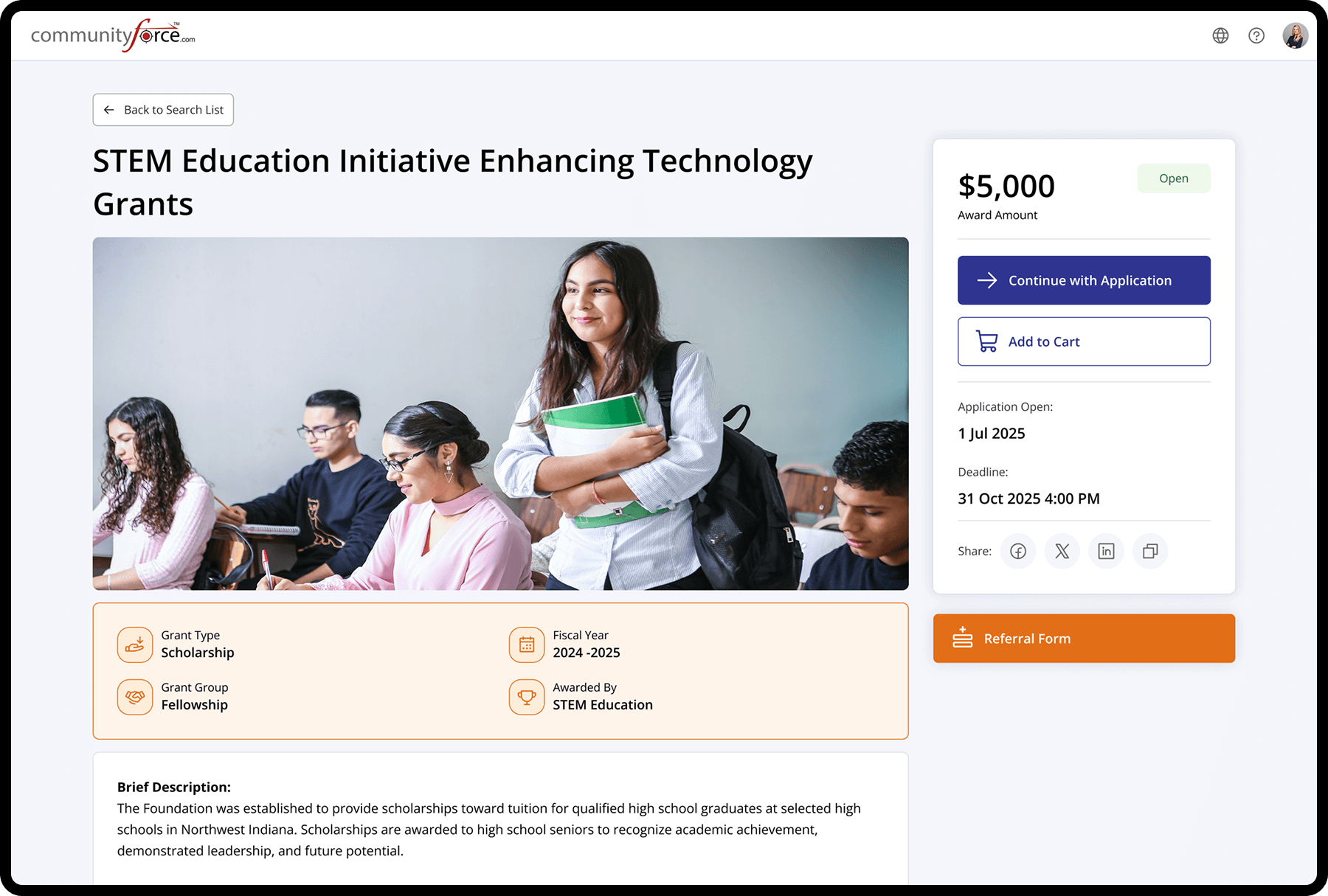
Scholarship & Grants Details
Opportunity Overview & Eligibility Interface
This page presents comprehensive information about each scholarship or grant, including award amount, application status, deadline, fiscal year, and program type. A detailed description helps applicants clearly understand the opportunity and decide whether it aligns with their eligibility and goals before starting the application.
Applicants & Application Builder
From application to submission, fully in control.
Track applicants, review activity from the dashboard, and structure application forms using intuitive drag-and-drop tools that adapt to your program requirements.
Reviewer Portal
The Reviewer Portal was designed to support efficient and focused application evaluation. The interface prioritizes clarity, consistency, and ease of navigation to help reviewers assess submissions with confidence.
Structured review flows and centralized information reduce cognitive load and enable reviewers to complete evaluations accurately and on time.
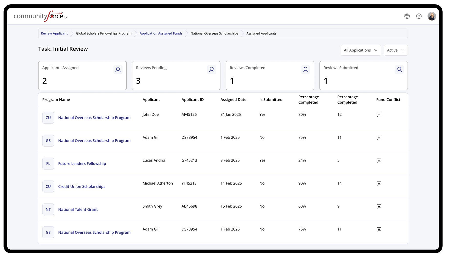
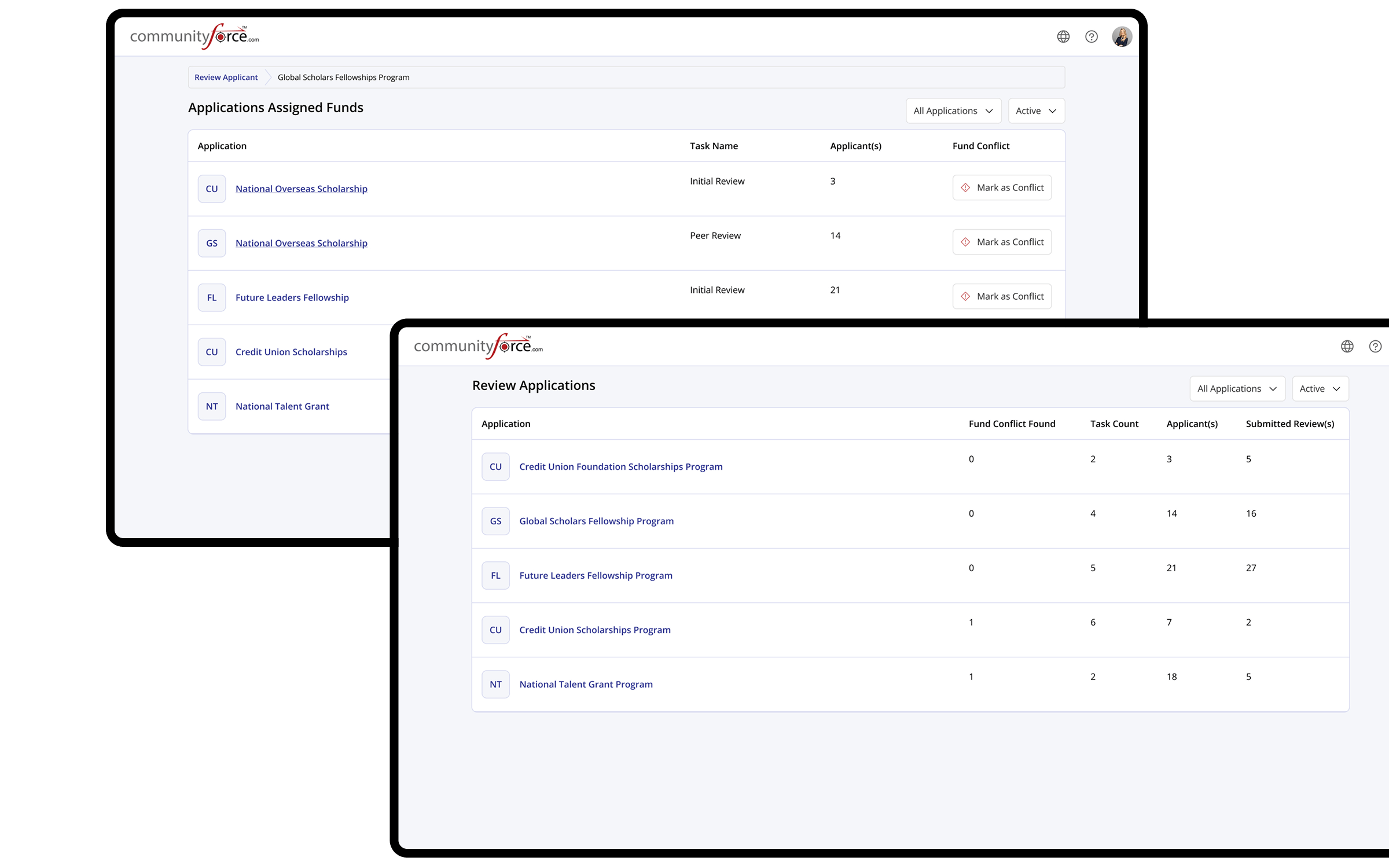
Assigned Applications & Funds
Review Assignments & Award Summary
These screens allow reviewers to view assigned applications along with allocated or recommended funding details. It provides a structured overview of application status, scores, and key financial information, enabling informed evaluations and consistent funding decisions.
Project
Mobile Friendly
Optimized for mobile with responsive layouts, touch-friendly interactions, and clear content hierarchy.